THE ICT HELPDESK
A professional IT support company approached me about a corporate website and logo, requiring a clean, fresh looking design that portrayed exactly what they do. They wanted tidy, neat and easy to navigate pages so that users would immediatley get what they're about.
The ICT Helpdesk were a start-up company that knew exactly what they wanted and the direction they were headed. They comprised of a small group of IT professionals that were looking for a website that would draw attention to their support offerings and services as a helpdesk for businesses spanning multiple sectors. They knew their stuff and had years of experience between them working in different IT related roles.
Logo
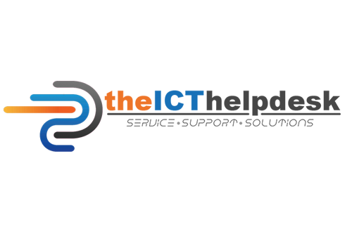
Before the website however, they spoke to me about a logo that would incorporate the colours of Sikh tradition, as this is what drove the ethos and values behind the company on a dialy basis (commitment, honesty, service and team work). I found this fascinating and quite inspiring as it said a lot about the business and the guys themselves.
I brought together some cool concepts for their business to represent their values. The final design that was selected definitely ticked all the boxes from the colours I used (orange, white, blue, black and grey) to the boldness of the type font. The tag line was brisk and to the point as well, which they loved and overall gave a corporate yet meaningful logo for their value driven company.
This logo is visually pleasing to view, and created the base for the rest of the project as the website naturally took up the colours used here in the logo that flow throughout the pages pleasingly.
THE ICT HELPDESK
A professional IT support company approached me about a corporate website and logo, requiring a clean, fresh looking design that portrayed exactly what they do. They wanted tidy, neat and easy to navigate pages so that users would immediatley get what they're about.
Logo
This logo is visually pleasing to view, and created the base for the rest of the project as the website naturally took up the colours used here in the logo that flow throughout the pages pleasingly.
Website
Following the logo, the site look and feel flowed seamlessly, comprising of striking and eye catching sections throughout with call-to-action buttons allowing the user to interact by viewing more information or navigating to forms to enter and sumbit their details. The navigation bar comprised soft hover buttons and drop-down menu items to capture the main topics. The entire menu section sat on top at all times, allowing the user to access nav items even if they scrolled further down the page.
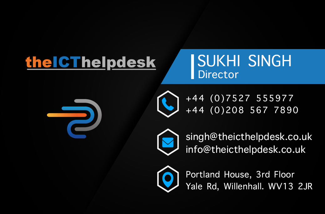
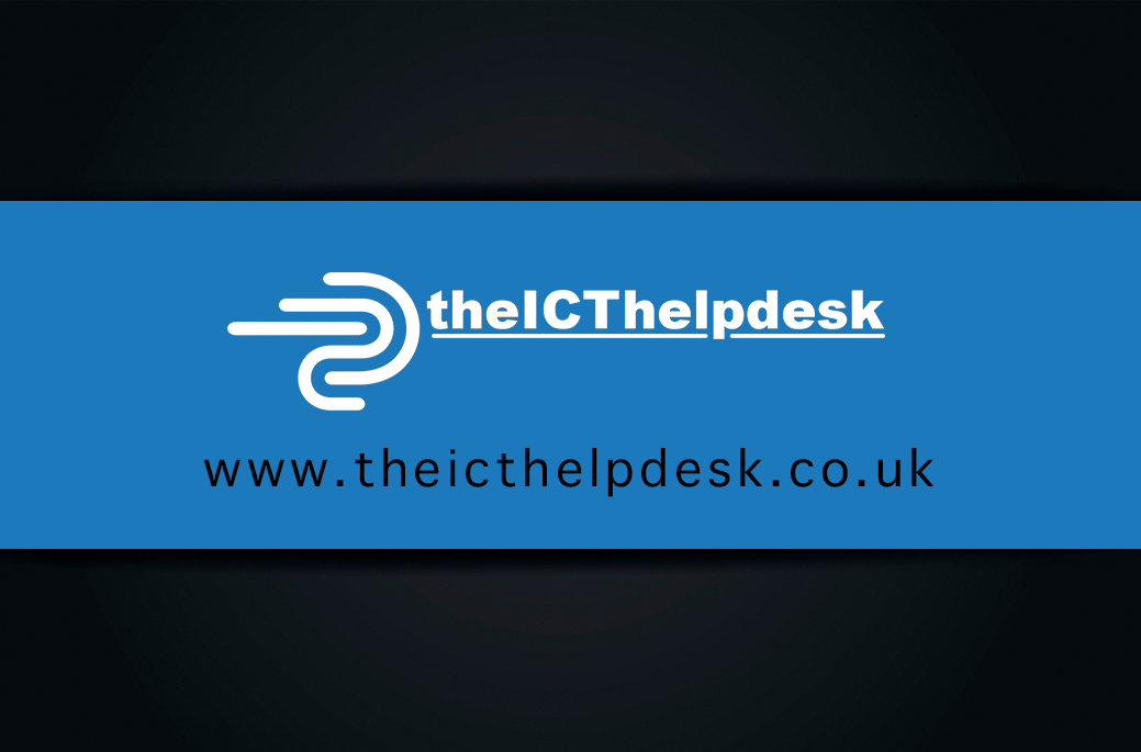
Business Card
As the last piece in this three piece suite to finalise the project, I combined a touch of class with a slice of the logo and site to produce a stunning card design. It was important to keep this design sharp, neat and striking to relay personality through its brand identity. I achieved this with a double-sided, contemporary design.